06 Jan BKC Kitchen and Bath Featured in Denver’s 5280 Magazine
Merry & Bright
The pair, who began dating in high school, discovered this bliss after recently renovating their 1928 Tudor in Congress Park. The makeover was inspired by their desire to host their children and two grandchildren, who also live in Denver, for casual meals in a pretty space they could all enjoy. “We needed better function and flow in our kitchen,” says Anne, who spent years bumping elbows with her husband as they prepared meals in the formerly tight space. “We got that—plus a truly beautiful room.”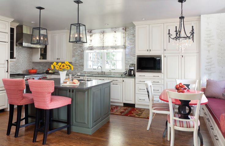
The couple hired architect Dean Lindsey (then of Nest Architectural Design and now with Shelter Lab Architecture) and kitchen designer Caitrin McIlvain of BKC Kitchen & Bath to design the layout, which included a small addition to increase square footage. Then the Fries looked to interior designers Kristi Dinner and Susan Schwab, principals at Company KD, to bring the details up to date. The pair fused the home’s traditional roots with modern style: simple lines, appealing patterns, fine details, and pops of color. “Their style is traditional; their furniture is traditional,” says Dinner. “The goal was not to change their style, but to freshen it up and put a modern twist on the traditional.”
Color is Key
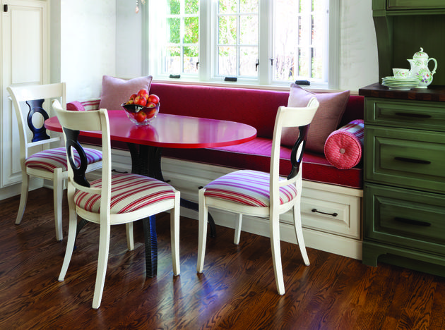
The Fries’ love of color drove the palette, so the designers created a custom breakfast table with a red-orange lacquer finish for a vivid pop. The hue also carries through in the Loro Piana fabric on the chairs and the banquette’s upholstery by Brentano. For a bold complement to all that red, the designers used green—from the opposite end of the color wheel—for the island cabinetry and a standalone hutch.
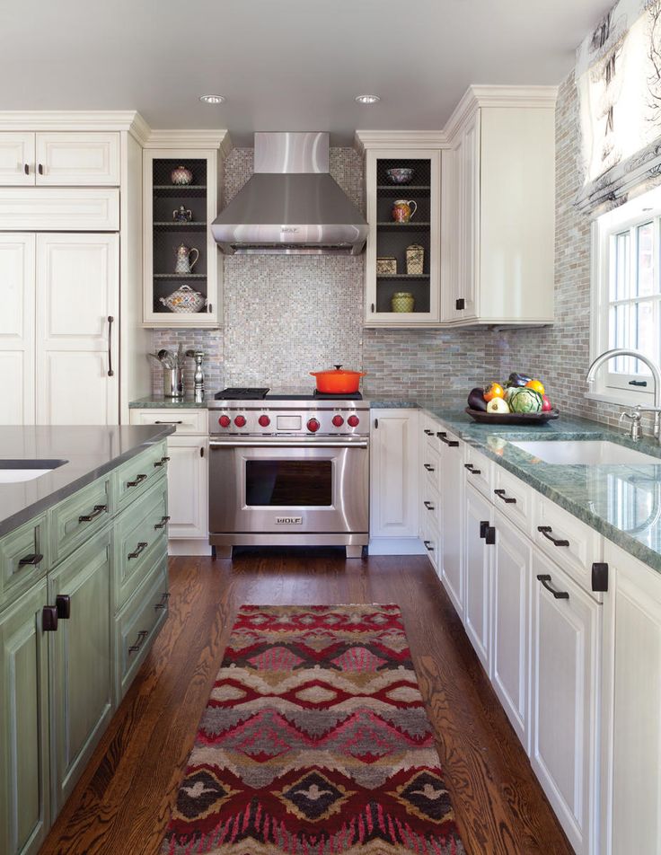
The design marries new and old in a way that honors both the contemporary elements and the home’s history. The backsplash tile features two styles: a small-scale, pearlized mini-brick tile—a modern tip of the hat to the home’s early-20th-century roots—and a bold, shimmery Chiclet mosaic behind the range. Both rise to the ceiling to play up the room’s height and add depth and texture.
The light fixtures, too, reflect a mix of styles: Sleek iron-and-glass pendants glow above the island, while a more traditional Murray Feiss chandelier crowns the breakfast nook. (The combination works, in part, because the fixtures have similar finishes.)
Chicken wire in a couple of cabinets and open shelves in the hutch allow the Fries to showcase personal objects. And in the adjoining sunroom, a custom top-down window shade shields street-level views for privacy and lets in light at the top. The topiary design on the fabric repeats on the wallpaper. “It’s got a sense of bringing the outside in,” Schwab says. “It’s a traditional design element, but done in a modern way.”
DESIGN NOTES
Architect: Dean Lindsey, Nest Architectural Design, nestarch.com; Denver Kitchen Designer: Caitrin McIlvain, BKC Kitchen & Bath; Interior Designers: Kristi Dinner and Susan Schwab, Company KD, companykd.com

